Case Study
Copysmith
Improving AI-powered copy generation tool (user) experience
At the end of the UX program at Springboard, I applied to work as product designer for a startup company called Copysmith for 40 hours. Copysmith offers a tool to help content marketing professionals by creating GPT-3 powered copies that are efficient and effective. GPT-3 is an autoregressive language model that uses deep learning to produce human-like text created by OpenAI.
Copysmith wanted to improve the organization of copy generations, which are currently equipped with little features.
Role
User research, designing, usability testing
Duration
40 hours
The Challenge
Due to the nature of the project, I thought it was critical to interview Copysmith users to learn their needs. Therefore, I requested 5 ideally heavy or paying users to conduct initial user interviews. However, only 2 users were ultimately recruited for interviews despite our effort, and one of them only used the product once. Not ideal, but Copysmith is an early stage startup, and I had to begin somewhere.
The most challenging part was discovering that none of them had a strong opinion about how they want the copy generations to be sorted or organized. One of the participants prefers using Google Sheets to edit and store all copies so that he can also track the associated sales data. The other participant shared his number one frustration was something else.
I read all feedback from users on Slack, and checked Hotjar to gain additional insight, but there was no data indicating user struggle with how copy generations are currently listed.
Identifying Current Problems
Under these circumstances, I explained to Copysmith that the copy generations organization doesn't appear to be the highest priority at this point. Rather, entering the same information over and over to create a new generation seems like one of the obvious pain points for repeated users, as one of the user interview participants shared.
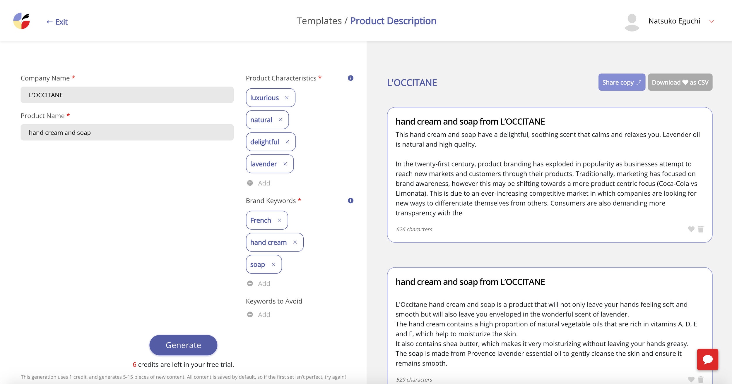
User interviews also revealed that it is unclear what to include in the audience field, use of heart icons is confusing, no indication between original generation and edited copy is frustrating, and how to edit the generations isn’t clear. One participant even thought the only way she could update the generated copies was to click the generate button again.
All values on the left page need to be re-entered, even if you are creating a new ad for the same company with identical information.
The information scent for how to edit the generated copies on the right page appears to be weak. The heart icons are used to make a selection to share and download, but the users didn’t find it obvious.
The Approach
Copysmith agreed with my suggestions, so I began focusing on solving the 5 issues discovered during the user interviews.
For issue one, entering the same information each time when creating a new ad, taking preset fields was the user feedback. While his suggestion was sound, I knew CSS was the major bottleneck for the Copysmith team, and it would take some time to build what the user suggested. Therefore, I came up with a clone idea which was giving users an option to copy existing campaigns in order to start from the generation page with all the values instead of a blank page. This way, engineers could simply add one button in terms of front-end design work. After creating the low-fidelity wireframes, I presented it to an engineer who liked this idea because she confirmed it is faster to implement.
One more thing to point out is how important it is to share a new design idea at this early point with an engineer. In my past experience working as a web designer, I learned it is critical to get engineers involved early on to ensure feasibility as well as aligning business goals with the marketing team. Presenting low-fidelity design at this point is also crucial because unfinished visuals naturally leave room for discussions that need to happen before requesting development. I first presented a high-fidelity design many years ago, and received minor feedback that made me assume everything else was good. A few days after our meeting, the engineering team put a break on the project. Due to some technical reasons, we had to make drastic changes. Since then, it has been my practice to check with engineers as early as possible.
Current page
New ideas showing cloning, checkboxes, timestamps, and edit buttons
Recruiting Usability Testing Participants
After the design was approved by an engineer, I created a high-fidelity prototype to conduct usability testing. Since recruiting real users was difficult, 4 out of 5 participants were from my personal connections. The fifth one was a real user and content marketing professional who participated in the initial user interview. Although testing with non-users is not ideal, it’s still important since I can cover approximately 85% of usability issues according to the Nielsen Norman group.
Feedback from Usability Testing
Cloning function was well received from the real user who initially shared his frustration for entering the same information over and over. Other participants who never used the product had no issues with how it worked.
For the use of heart icons, I introduced adding checkboxes to make a selection. All non-user participants (4) made zero mistakes performing the tasks during usability testing. However, the real user (1) was confused about what the checkboxes do since he knew heart icons worked for making a selection before.
Not only in this case, but with any changes potentially confusing to existing users, it would be a good idea to inform them of new changes. Existing users are not less important than new users.
The high-fidelity design used to conduct usability testing.
The final design reflects new feedback received during usability testing, such as adding a save button and differentiating between original generation and edited copy. Also, gray icons lack contrast to meet the WCAG AA standards, which I shared with the team.
Video demo
The Core Issue
While collecting feedback for the audience field, the 1 real user shared highly critical feedback about the product, the quality of copy generations.
At the initial user interview, he stated that he had no specific audience for creating new copy, and he had no idea who would be an acceptable audience. For instance, if marketing directors and CEOs would be a valid input versus a more obvious audience, such as women or millennials is unclear.
Since the audience field was required, I thought making this field unrequired would solve the issue, and confirmed with the engineer whether that was an option.
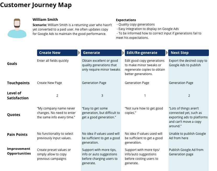
The user told me his concern was that he wants to provide valid audience information, if that means he can obtain better quality copy generations. He also noted that Copysmith currently lacks a way to help users correct the situation when generated copies don’t meet users expectations. Two other participants shared similar issues stating they didn’t feel comfortable clicking the generation button when they weren’t sure what was entered would create good quality copies. They were concerned about costs incurred with each insufficient quality copy generation.
Conclusion
Generating exactly what users need is an extremely challenging task. Guiding users on what would be more effective input for copy generations increases customer satisfaction and potentially increases the number of paid users. So I emphasized this important insight to the team at Copysmith.
The 1 real user was able to share more details about how he preferred to work with copy generations at the end of the usability testing session. His feedback ultimately allowed me to come up with the organization idea initially requested by Copysmith. Combining feedback from another test participant who questioned the current card based user interface, the new design reflected both insights. Hopefully, the low-fidelity wireframes I designed at the end of this project will enable the initial conversation between a designer, engineer, and business. If they can gain additional feedback, particularly from paid users, this organization design would be an even better one.


